HOME > COMPANY > About us
우수한 품질과 서비스를 통해 도움을 드리고 고객과
시민에게 대공간 혁신의 기회를 제공합니다.
We provide excellent quality and service and offer opportunities
for innovation in large spaces to customers and citizens.
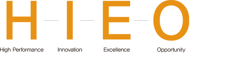
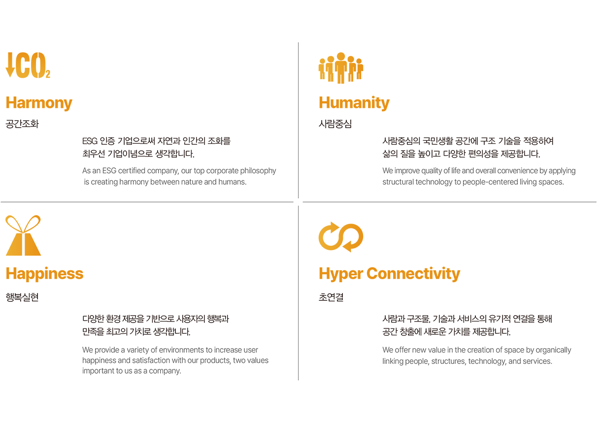
공간조화, 사람중심, 행복실현, 초연결의 4H 가치를 전파하고 체계화한다.
Prepare and systematize the values of the 4H
(Harmony, Humanity, Happiness, Hyper Connectivity).
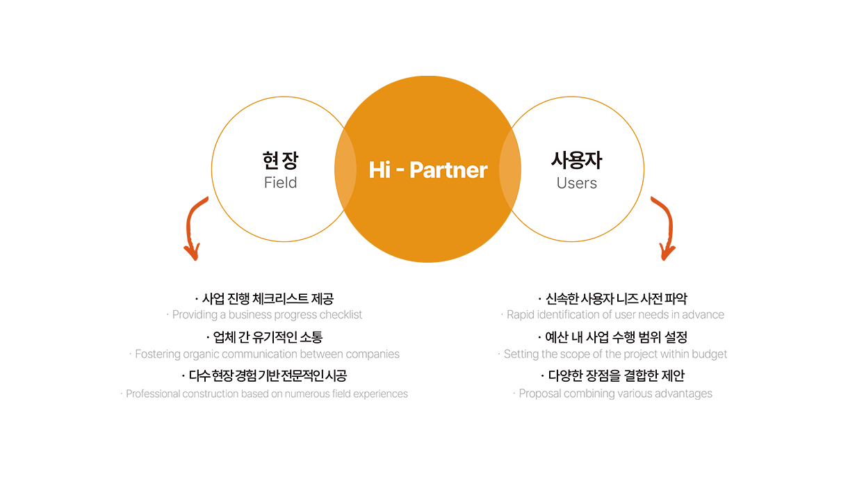
다양한 현장 상황과 사용자 니즈에 안정적으로 대응하며
고객의 우선순위를 파악하는 데 최선을 다합니다.
We reliably respond to various field situations and user needs,
and do our best to understand our customers' priorities.
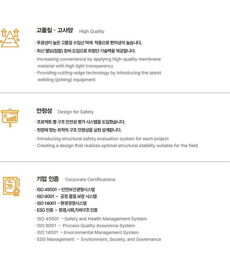
지속적인 연구개발과 최신 기술을 적용하여
3가지 핵심 경쟁력을 통한 차별화된 서비스를 제공합니다.
We provide differentiated services through three core competitive strengths.
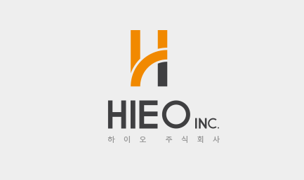
하이오의 업태적 특징이 나타날 수 있도록 구조적인 그랙픽 모티프를 사용하였습니다, 아이덴티티를 재구축하여 텍스트로써의
정보와 그래픽으로써의 기업 이미지의 전달력을 구축함과 동시에 정돈된 시그니처로 고객에게 접근합니다.
하이오의 기업 가치인 4H를 상징하는 대문자 H의 변형으로 심볼을 구성하고 H와 천막의 호를 합성하여, 그 밑으로 드리워진
그늘로 하이오의 사업인 천막 구조물을 상징화한 심볼입니다.
The symbol emphasizes the business characteristics of HIEO and, by rebuilding our identity, it has the
ability to deliver our corporate image as graphics and information through text, while emphasizing the
reliability of our products and corporation.
It maintains HIEO‘s orange brand color, and uses a variant of the capital letter H, which represents HIEO's
corporate 4H values.
The H and the arc of the tent are synergized, and the shadow cast below symbolizes HIEO‘s tent structure
business.


Vertical
Horizontal
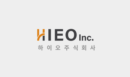
하이오만의 색상은 배색의 기본이되는 주조색과 주조색을 보조해주며 활용에 다양성을 부여하는 보조색으로 구분되며,
이색상들의 조합으로 브랜드 아이덴티티를 강화할 수 있습니다.
HIEO's colors are divided into casting colors, which are the basis of coloration, and auxiliary colors that assist casting colors and give diversity to their application, Combinations of these colors can enhance brand identity.